Yesterday, I saw hrbrmstr’s post about a weekly visualization contest and thought it was a terrific idea.
This week dataset is about drone reports in the USA. I first wanted to map the number of sighting per state residents but someone had already done a nice post about it so I’ll try something different.
In a first time, I kept what was done by hrbrmstr to get the data.
#get copies of the data locally

URL1 <- "http://www.faa.gov/uas/media/UAS_Sightings_report_21Aug-31Jan.xlsx"
URL2 <- "http://www.faa.gov/uas/media/UASEventsNov2014-Aug2015.xls"

fil1 <- basename(URL1)
fil2 <- basename(URL2)

if (!file.exists(fil1)) download.file(URL1, fil1, mode = "wb")
if (!file.exists(fil2)) download.file(URL2, fil2, mode = "wb")


xl1 <- read_excel(fil1)
xl2 <- read_excel(fil2)


drones <- setNames(bind_rows(xl2[,1:3],
                             xl1[,c(1,3,4)]),
                   c("ts", "city", "state"))

drones <- mutate(drones,
                 ymd=as.Date(ts, origin = "1899-12-30"),
                 yw=format(ymd, "%Y%V"),
                 wk=as.Date(sprintf("%s1", yw), "%Y%U%u")-7,
                 location = paste(city, ", ", state, sep = ""))
Then I used the geocode function of the ggmap package to get the reported coordinates of the sightings
The Google Maps api having a limit of 2500 daily queries and the server response being slow, I applied the function on the unique locations city, state to accelerate the process.
location <- unique(drones$location)
coord <- geocode(location, output = "latlona")
df_coord <- cbind(location, coord)

drones_coord <- left_join(drones, df_coord)
With dplyr’s mutate, one can count the number of drones seen each week in each location. Finally, filter excludes the reports from Alaska or Hawai to focus on the mainland.
To lower the reliance on the Google Maps api, the final dataset is saved.
drones_sight <- drones_coord %>%
group_by(wk, location) %>%
mutate(count = n()) %>%
filter(lat > 25 & lat < 50, lon > -150 | lon < -70)
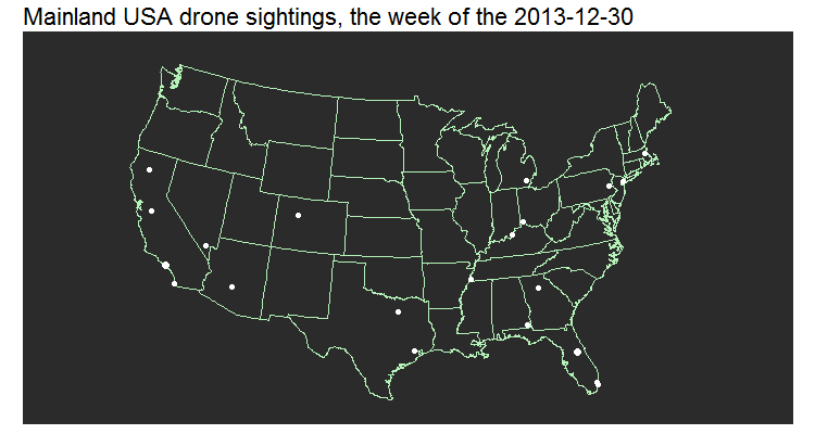
saveRDS(drones_sight, "drones_sight.rds")For the visualization, I plotted the location of the report on a map with the help of ggplot2
us <- map_data("state")

gg <- ggplot() +
  geom_map(aes(x = long, y = lat, map_id = region), data = us,
           map = us, fill = "#2b2b2b", color = "#b4f2b8", size = 0.15) +  #b4f2b8
  geom_point(data=drones_sight, aes(x=lon, y=lat, frame = wk, size = count), color = "#ffffff") +
  scale_size_area() +
  labs(x = NULL, y = NULL, title = "Mainland USA drone sightings, the week of the") +
  theme(axis.ticks = element_blank(),
        axis.text = element_blank(),
        panel.background = element_rect(fill = "#2b2b2b"),
        panel.border = element_blank(),
        panel.grid = element_blank(),
        legend.position = "none",
        plot.title = element_text(size=22)) +
  coord_fixed() +
  coord_map("albers", lat0=39, lat1=45)
Then I wanted to use gganimate to see a weekly evolution but I had issues that I was unable to resolve on my Windows machine.
gg_animate(gg)So, have a GIF instead.
g <- gg_animate(gg, ani.width=750, ani.height=400, interval = .5, "drones.gif")